Albert Heijn Scan & Go
WHEN
2017
DONE AT
Handmade
WITH
Nate Grubbs
FOR
Albert Heijn
MY ROLE
UX, Design, Prototyping
THE ASK
Redesign the instore self-service checkout for Albert Heijn grocery stores.
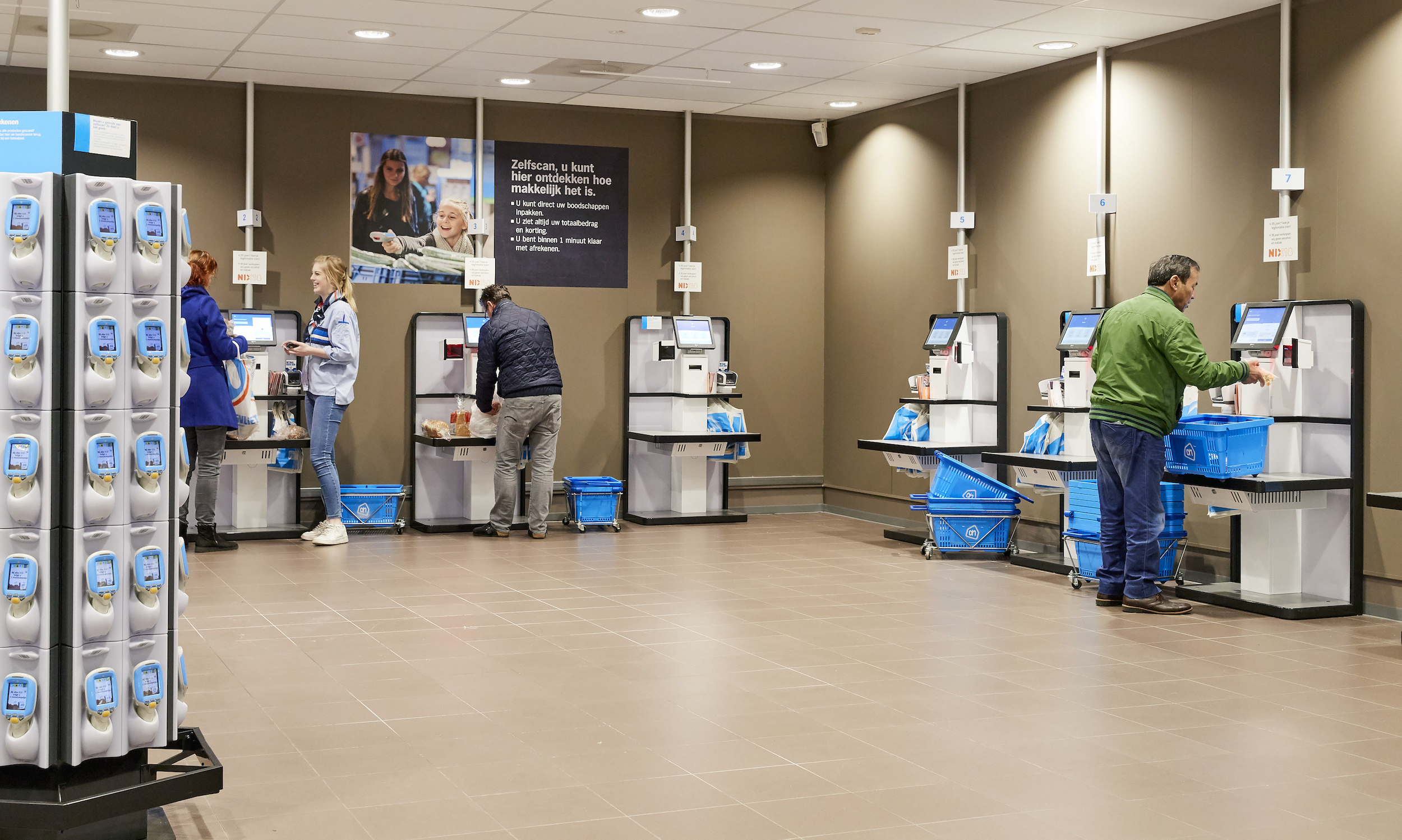
IDEATION
Explore different options to pick a winning layout
We began exploring several layout options to validate clarity and ease of use. From a first round of explorations the best elements were combined into a new layout that's coherent, clear and simple to use.

SCANNING
Start building a list by scanning your groceries
The new layout offers a clear separation between instructions on the left and your list of scanned groceries on the right.
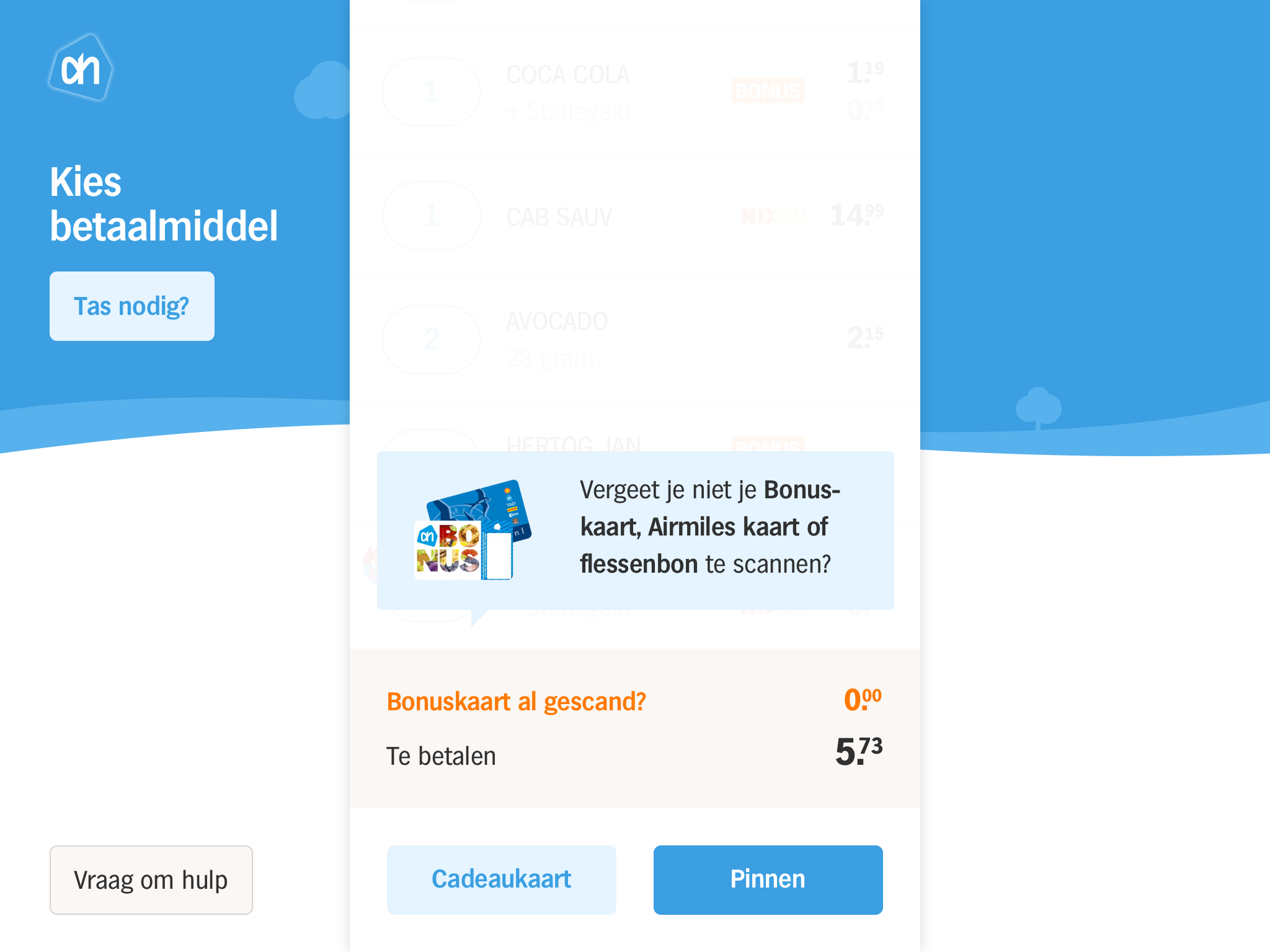
LOYALTY
Select a payment method to continue
We help explain moving into checkout by moving the scanning list center stage.
In case they haven't yet, we remind customers to scan their loyalty card to get a discount.
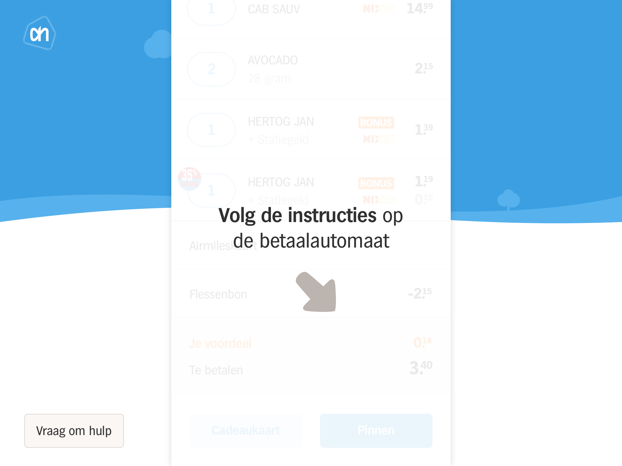
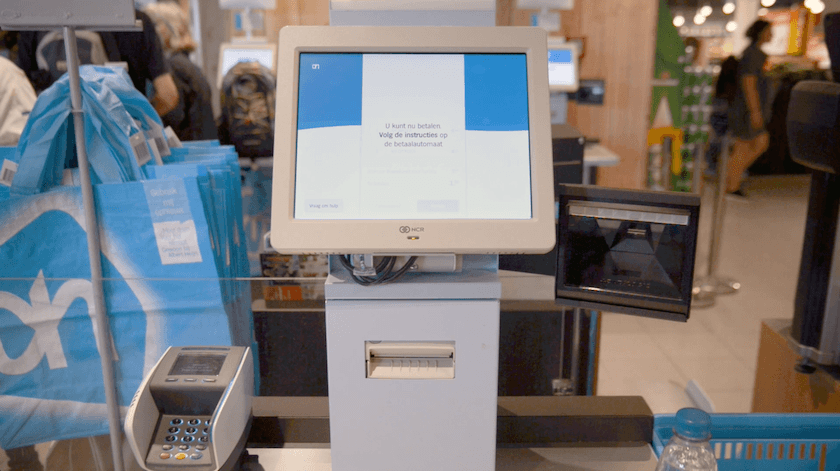
PAYMENT
Finalize your payment on the PIN-terminal
We continue guiding users towards the next step in the checkout flow with cues that point to objects in the real world.
Customers can finalize their payment using the PIN-terminal located on the side of the screen.
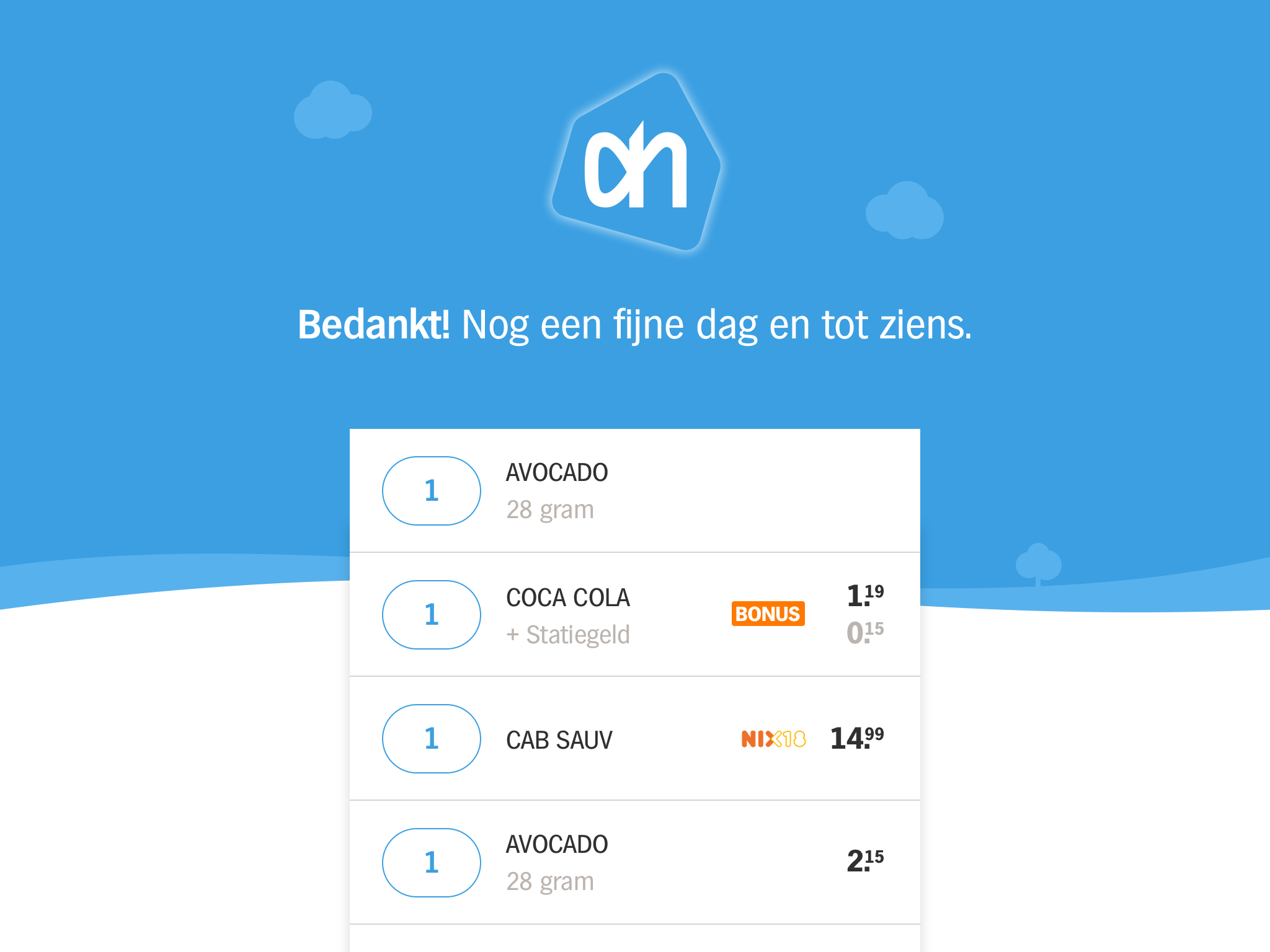
CHECKOUT
A touch of 'magic' as you leave for the exit
We evoke a positive emotive response at the end of checkout with a receipt that 'magically' transitions from a digital into physical form.

"This animation at my local supermarket makes me very happy."
Juan Buijs, UX Copywriter
260 retweets, 1.124 likes
See it all in action
WHEN
2017
DONE AT
Handmade
WITH
Nate Grubbs
FOR
Albert Heijn
MY ROLE
UX, Design, Prototyping, Cardboard Mockup
Did I catch your interest?
Feel free to reach out.
casper@iamtwofour.com
© 2024 Casper van Huisstede - Built with Semplice.